


Challenge
New Horizons was a global name in technology training, but the brand wasn't telling that story anymore. The visual identity felt dated. Messaging was inconsistent. In a space full of competitors making noise about innovation, New Horizons needed to look and sound like the leader it actually was.
Strategy
Started with the landscape. Ran competitive analysis and market review to find the whitespace and sharpen differentiation. Then built a repositioning strategy grounded in innovation, credibility, and forward-focused learning. The goal was to align identity and messaging with where the company was headed, not where it had been.
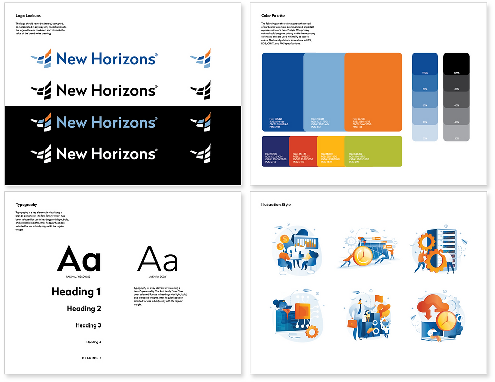
System
Led the development of a modernized brand system from the ground up. Updated the logo and visual identity to reflect a more contemporary market position. Built a refined messaging framework that gave the brand a clear, consistent voice across every channel. Established a scalable design language for print, web, and marketing materials. Created brand standards and creative guidance so teams could execute with confidence without drifting off course.
Outcome
The brand went from feeling like a legacy player to showing up like a modern one. Messaging landed with more clarity. Visual execution got sharper. And the new system gave the organization a foundation that didn't just support today's marketing. It was built to scale with the business.

Competitor Brand Analysis
Corporate Brand Guidelines

Social Media Video

Digital Ad Concepts

Landing Page

Corporate Illustration Style

Online Certification Badges

Course Catalog